How might we help women find clothing that inspires them and purchase them effortlessly?
Product Description
Aritzia’s eCommerce experience is built on Salesforce Marketing Cloud (previously Demandware). The online experience contained clothing category pages, product detail pages, brand pages, and (at the time) campaign pages.
Who were we designing for?
Women who wanted well made, luxury clothing but did not want to (or could not) pay the cost of luxury brands. They primarily lived in urban centres. They didn’t just want clothes – they wanted clothes and experiences that inspired them.
Motivation
To acquire items that helped actualize the idealized person they had in their head – someone who is fashionable, capable, and successful
GOALS
To wear well made clothes that represented the culture and values of a luxury brand, but without the luxury price tag
To effortlessly navigate the store or the website when purchasing a product
Frustrations
They are unsure how a product will fit when buying online
They are unable to find the item they had seen in person, in an email, or on social media
A product that they want is out of stock before they could purchase it
How Did I contribute to solving the problem?
My work consisted of three main areas of focus:
Continuous improvement of Aritzia.com through feature development which focused on making the shopping experience easy and efficient
User interviews and usability testing to identify potential pain points
Campaign development which supported marketing functions and created content that inspired. This work included ideating with the creative team, advocating for the user experience in campaign experience discussions, and building out those experiences with code.
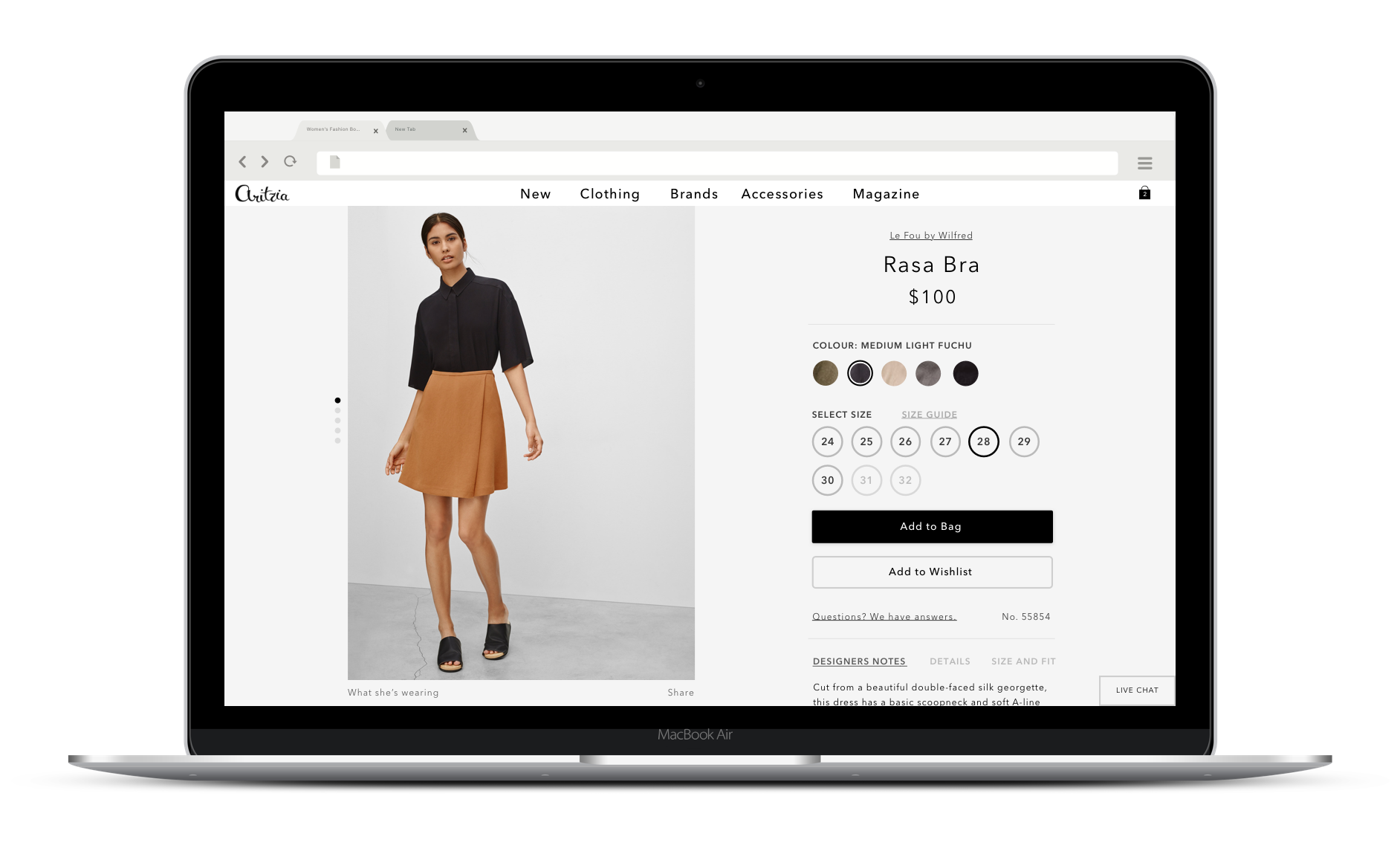
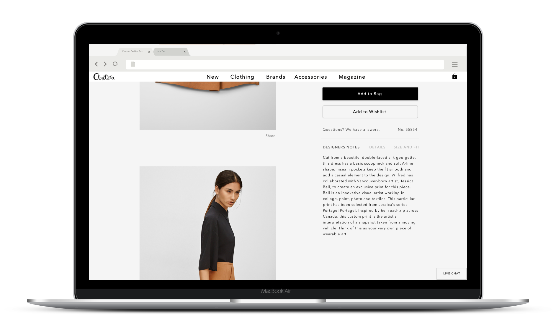
Continuous improvement example: The Product Detail Page
The Product Detail Page (a.k.a. PDP) had a solid foundation. It had the right information, inspirational photography, and a clear call-to-action, but looked dated. There was a desire to elevate the PDP experience to better align with the experience our customers had in store. At the time, the conversion rate on desktop was greater than that on mobile, so it was prioritized.
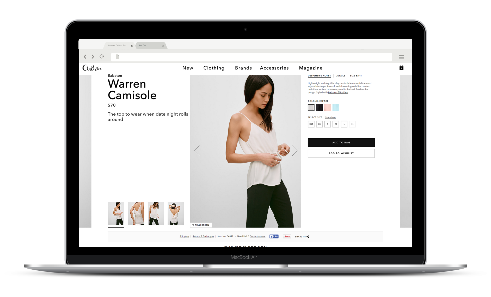

During the ideation and iteration process, two core re-design values arose:
Regardless of where they are on the PDP, ensure that the user has everything they need to complete the desired action (in this case, Add to Bag)
Leverage natural behaviours when possible.
We resolved the first value by creating a panel that remained fixed as the user scrolled through the page. It was critical that the call-to-action was visible and that they had all the information they needed to add the product to their bag.
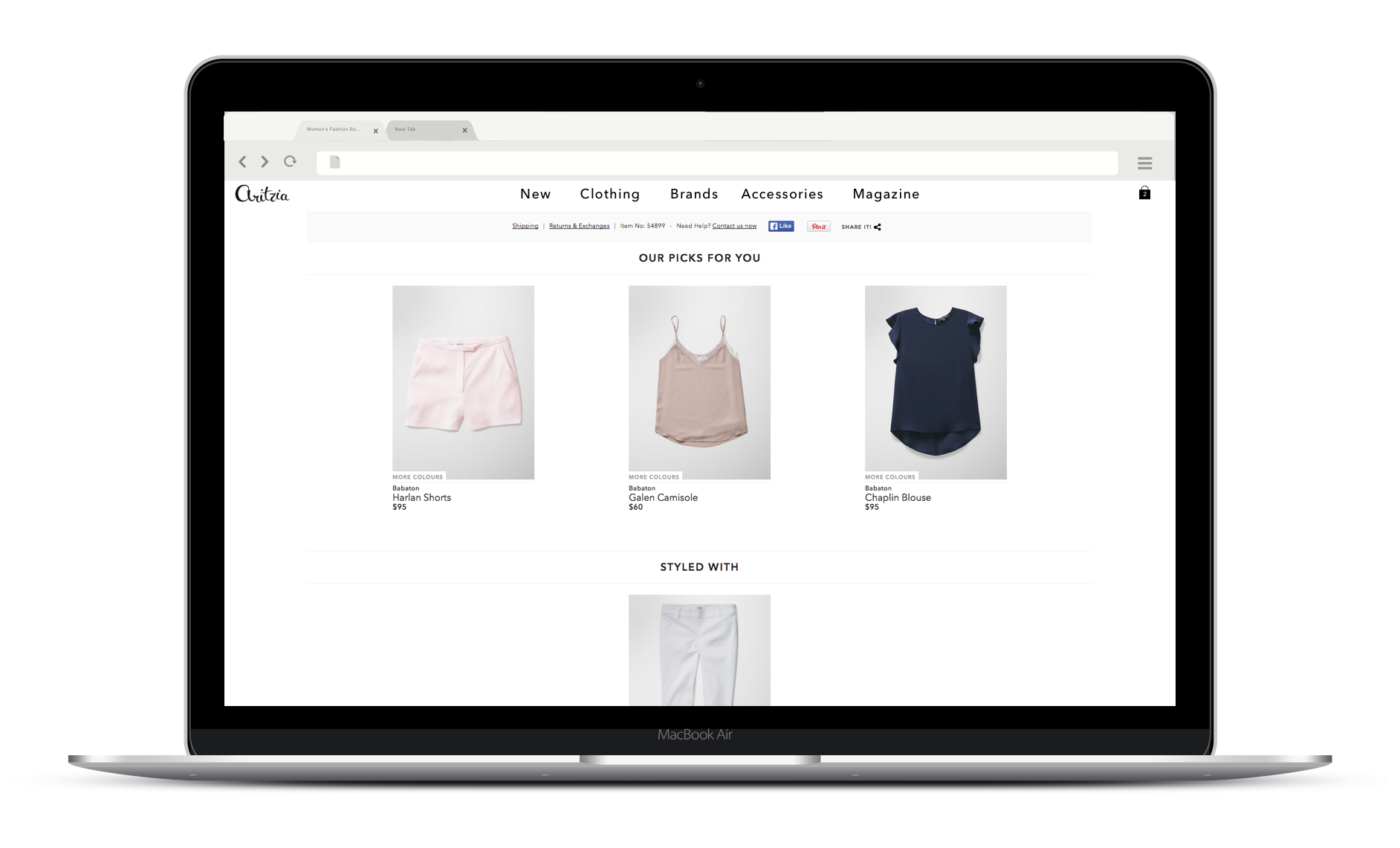
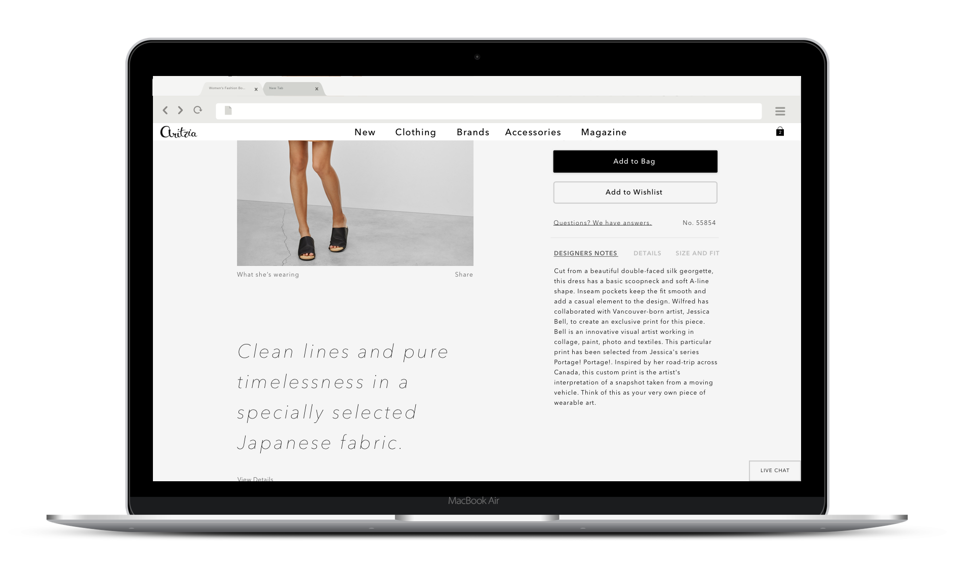
The second was resolved by pushing back against the myth that users don’t scroll. We found that users scrolled quite far down on category pages to discover new products. We leveraged this behaviour in the new design which encouraged scrolling as a way to further explore the product images. This did two things:
Reserved the user’s click for more important things (like Add to Bag)
Decreased the time needed for a user to get an idea of what the product is all about. With a few scrolls, they would have a clear understanding of the product offering.

Role in team
Interaction Designer, Visual Designer (UI), User Interviewer and Usability Test Facilitator, Front-end Developer