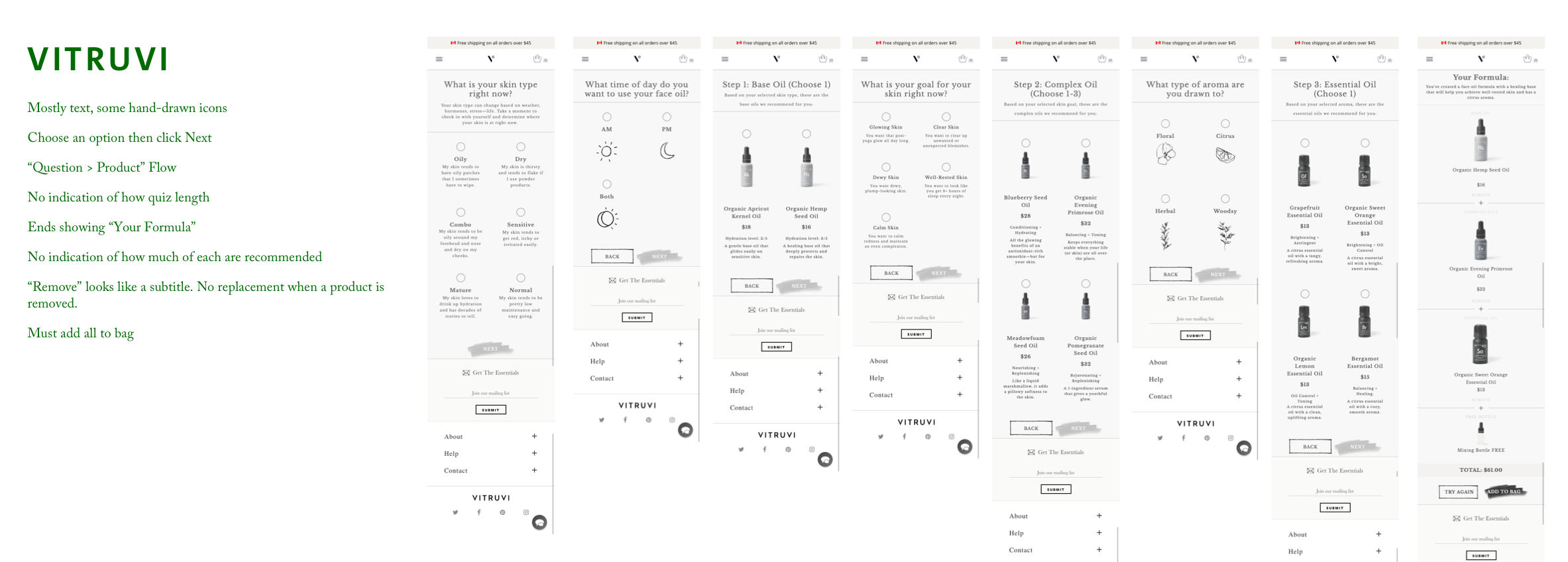
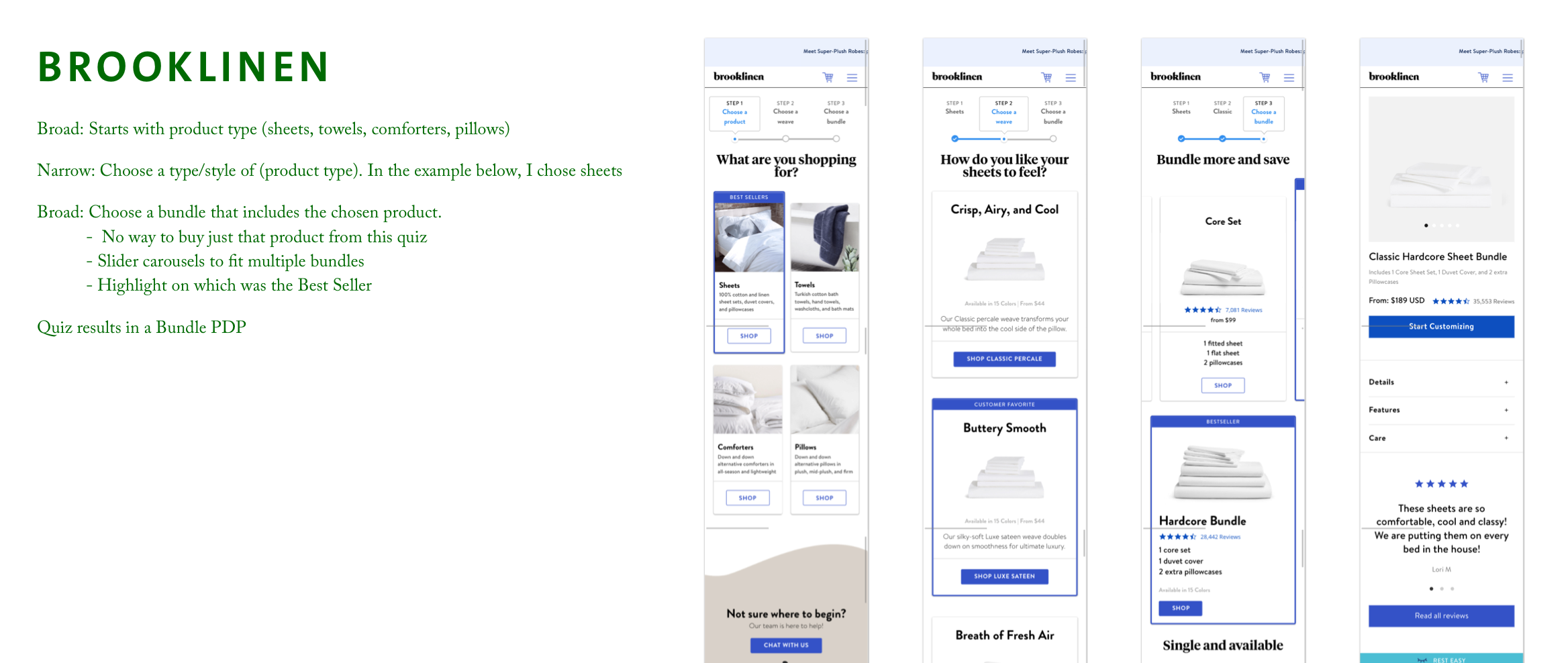
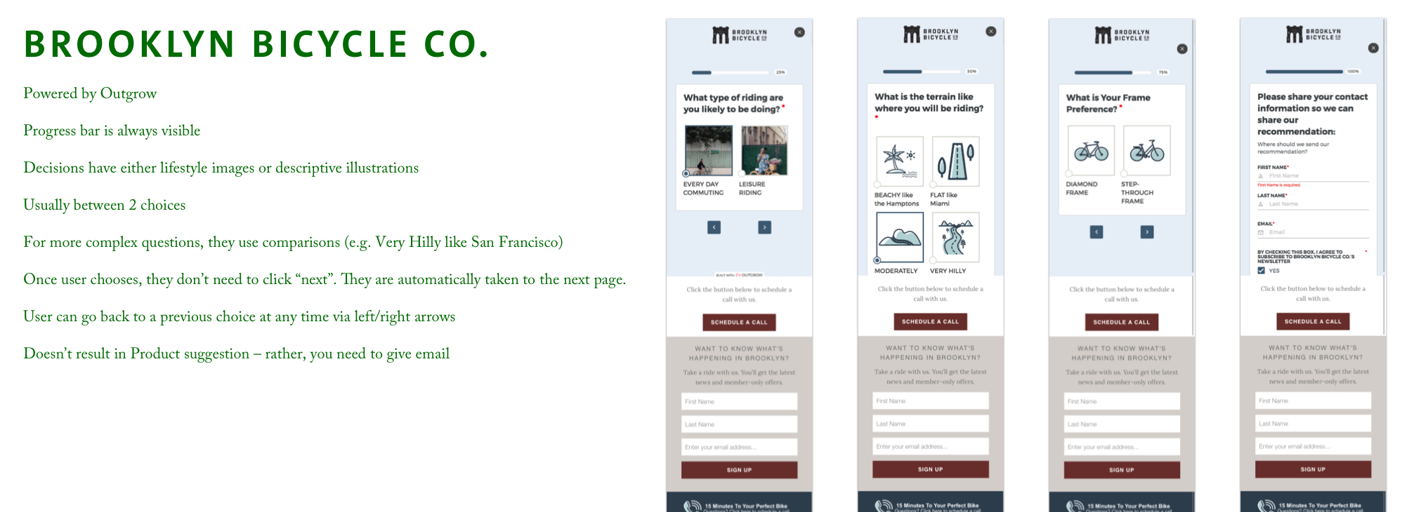
Saje
Product Selection Quiz
Company
Saje Natural Wellness
Role
User Experience Designer
Team Composition
1 Digital Experience Designer, 1 Product Manager, a small cross-functional task force, and a team of external developers
Scope
User Research
Facilitation
Prototyping
Interaction Design
Visual Design
QA
Problem Space
In 2019, Saje was growing fast. A combination of recently breaking into the U.S. market and a growing awareness of the brand in Canada brought an influx of new potential customers to the company.
Brand on-boarding was primarily conducted via memorable in-store experiences where friendly experts guiding you through the product offering. Unfortunately, the physical store openings were slowing down which meant that the primary point of contact with the company would be via Saje.com. This presented the challenge of providing the high quality, personable in-store experience online.
Project Goals
Help brand new potential customers navigate the Saje’s wide-ranging product offering
Emulate the hospitality and warmth of the in-store Saje experience online
Increase the conversion rate of New Users on Saje.com
How might we help new online customers find a Saje product that perfectly fits their wellness goals in a way that emulates the warmth and hospitality of the in-store Saje experience?
Research
Functional Competitive Analysis
A year prior, I had introduced the idea of a guided quiz to combat the rising challenge of on-boarding new users. When the opportunity became more visible to the company, this functional execution (along with many other initiatives throughout the business) was seen as a key way to solve the New User On-boarding challenge.
Rather than narrowing our focus on direct, in-direct, and tangental brand competitors, we instead looked at a variety of ways that the guided quiz was being executed. This required me to analyze ~15 different quizzes, some of which had upwards of 25 different questions/steps. From these quizzes, I identified some interesting themes:
The quizzes all made some effort to make it feel personalized, whether by adding the participant’s name to each step, having successive questions be self-referential to previous answers, or a variety of other ways
Email capture (or even account creation) was a core requirement
Many had an illustrative nature to them
Cross-functional Facilitation
Since the core intention of the project was to emulate the in-store experience, this project wouldn’t be solely an online endeavour. I helped coordinate the creation of a small task force that consisted of members from the in-store, product development, customer experience (call centre), and copy/regulatory teams. This intersectional team would allow us to capture the essence of the in-store experience while ensuring that desired product offerings were covered in a way that met our regulatory standards.
It was also a golden opportunity to conduct a variety of design workshops, like the Lightning Design Jam, to brainstorm with collaborators outside of my usual team.
Approach
Translate the experience online
At the time, the in-store experience had been codified into a series of repeatable steps called “The Experience”. Starting with “Curiousity” where the in-store employee would try and understand the state of the person. This was followed by “GPOP & Educate” which translates to “Get Product on People”. This step is what it sounds like: getting product on people was the most profound way to engage with Saje products. This step was then followed by “Recommendation”.
This process would loop until the potential customer found something that fit their wellness needs.
Generally, these steps could easily be transferred online. The most difficult part to emulate was “GPOP”, so we developed a new acronym: “SPOP” which stands for “Show Product on People”. By illustrating usage, it both communicates application practices and presents evocative imagery which meets the education requirement.
The loop was emulated by allowing the user to re-take the quiz and potentially come up with different product recommendations.
Hand-crafted
To help the quiz feel like the warm in-store experience Saje was well known for, we ensured that the copy sounded like a friendly expert - someone who knew what they were talking about and presented it in a conversational way. We also used hand-drawn illustrative elements to bring a bit of humanity throughout the quiz.
Process
Wireflows
One of the early steps was to map out what The Experience could look like which helped gain alignment from the various stakeholders on both the project as a whole and the logic that would guide our potential customers through.
Content inventory
In tandem with getting alignment on the general flow through the Product Selection Quiz, we had to create an inventory of the product categories and products. These were chosen based on purchase frequency, most engaged with in-store, and most representative of Saje’s product and brand offering.
Curveball
We brought our devs in early on and they presented two possible approaches: dynamic product suggestions or manual product suggestions.
Dynamic Approach
Dynamic would use a weighted score method that assigned a number to the answers throughout the quiz and suggested products that matched that score. This would allow for less product management but would need more generic questions.
Manual APPRoach
Manual product suggestions would be merchandised by hand which would be more product management and content management since the question lines would be more category specific.
The manual would better match our in-store experience and provide a personalized set of product suggestions, but I worried that the effort surpassed the opportunity. Ultimately, the business felt that the teams executing this feature had the capacity to manage both the content and products, so we went with the latter option.
Question development and flow mapping
Once we had alignment on the logical flow and the way that we would present product suggestions, I worked alongside the cross-functional task force to develop the various question lines. Once the questions were more or less developed, I translated them into flow charts so they would visually display the narrative journey we were taking the potential customer on which also made it easier to talk through when presenting to various stakeholders who would approve them.
Example of the “energy” question line
The question line excel sheet translated into a flow chart
A closer look at the beginning of the “energy” question line flow chart
Low-Mid Fidelity Mockups
The first set of mockups were essentially extrapolations of the wireframe. The various stakeholders reviewing the work responded much more positively when real product images, product names, and pseudo-realistic copy is used. This means mockups at this stage are often low to mid fidelity
The key focuses at these stage were:
Illustrating how “personalization” would appear in the journey. This was done by having the first question be “what’s your name?” and having that answer permeate through.
Working through the presentation of the question lines and how questions that assist with product refinement would appear.
The presentation of the recommended products. Saje products require quite a bit of upfront education, so working through how that could be done succinctly was important at this stage.
After the first round of summative usability testing that resulted in positive completion rate and usability outcomes, I began to refine a few more things:
The selection states on the buttons. This is the key point of interaction and wanted it to feel substantial and fulfilling.
The UI around adding all recommended products to the user’s bag
The visual language of the Product Selection Quiz to better match with the creative direction of brand campaigns at the time.
Design Highlights
In the final version, the interactivity remained largely the same. The most significant change was the move to a much more free-flowing UI style. This was due to feedback speaking to mismatch of the button and card UI style with the feeling of the in-store experience. The desire was something that felt more airy and less visually overwhelming.
Circling your choice
To emulate the feeling of someone filling out a prescription, I used hand-drawn elements as the hover and select states of the buttons. This was often a delightful moment with users during the testing phase and was resonate with our customers when the quiz launched.
Recommendation carousel
The decision to present the product recommendations as a carousel occurred early on. The end result moved away from a product “card” based UI to a carousel that leveraged the full screen. What that allowed us to do was to give plenty of real estate for the product hero images.
These large product hero images had double duty - they showed what the product looks like, but also how it was used by visualizing the product in the context of use (spraying the essential oils, dropping the essential oils into a diffuser, etc.)
The copy below the product image tried to summarize a page’s worth of information into two statements. One spoke to the key ingredients while the other outlined the usage and benefit.
I wanted to ensure that the “Add to Bag” button was visible above the fold. This was challenging (specifically on mobile) due to the amount of information and often the placement of the product image on the page. We were able to manage it by folding the price into the primary CTA.
Pausing for verisimilitude
One small moment that was include due to usability testing was a “processing” step. Due to the strictly defined narrative structure of the quiz, there wasn’t any processing time. Users didn’t know that and commented on how quickly the recommendations appeared, stating that they worried that the system didn’t properly consider the options they had chosen.
To combat that perceived lack of consideration, we added a screen that replicated a processing step. Successive testing and launch feedback saw a positive response to that step in the sense that users felt that the recommended products were truly just for them.
Results
To allow for the data to normalize and compensate for sale periods, we waited until the updates were live for three months.
After that time passed, reviewed Google Analytics and the built-in Demandware platform analytics. Three metrics increased that indicated that this design update was a success:
73% of the users that engaged with the quiz were new users which meant that the hypothesis that a tool like this would be both attractive and useful to that user group was proven true
Those that completed the quiz were 21% more likely to checkout and increased their Items per Transaction (IPT) by 1.2
For those that engaged with the quiz, we saw repeat usage meaning that the user completed the quiz at least twice which doubled the exposure of our key products to these potential customers.
The improvements above led to a ~20% revenue lift amongst new users over the first 5 months the feature was live.
Improving my process
Though the quiz was fundamentally a success, it wasn’t long lived. Primarily due to the effort it took to update anything. A single question or an out-of-stock product required a lot of manual effort. I had communicated this effort earlier on, but I can do a better job at quantifying that effort so that it’s better understood by the various stakeholders and decision makers.
I was also fairly dead-set at creating a guided selling quiz from beginning. Allowing for a wider exploration of possible solutions by clearly identifying user needs may have led to a more effective solution.